Pitching remote work in 2016
A creative, comical, retro way to sell telework to the corporate crowd.
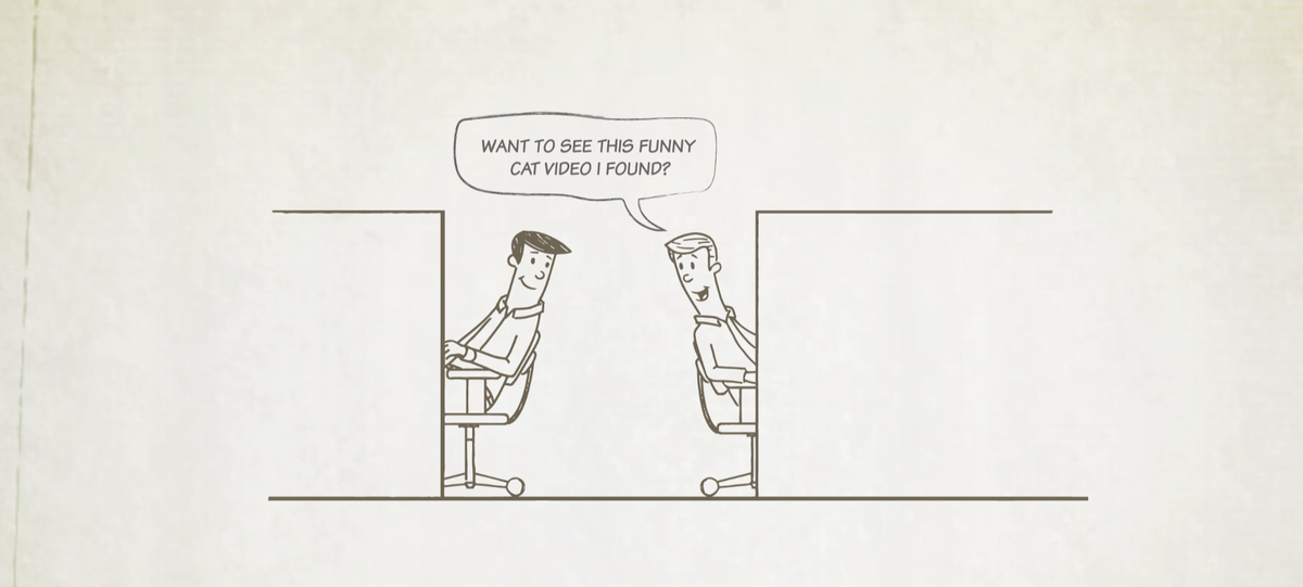
This eclectic campaign for remote work was a blast. Full of personality, throwback comics, cheeky writing and technology-forward persuasive copywriting, the site was a multi-media masterwork that took massive swings at trying to convince employers to say yes to remote working...in the year 2016.
The site was mimicked the look and feel of vintage projector screen, using browser animations to create a fully-immersive retro vibe. Tongue-in-cheek writing that evoked a tone somewhere between Dilbert and The Family Circus, the blind innocence of corporate malaise with lampooned with deadly satire. Theme after theme, we created comics to highlight the absurdity we put up with in the common workplace.
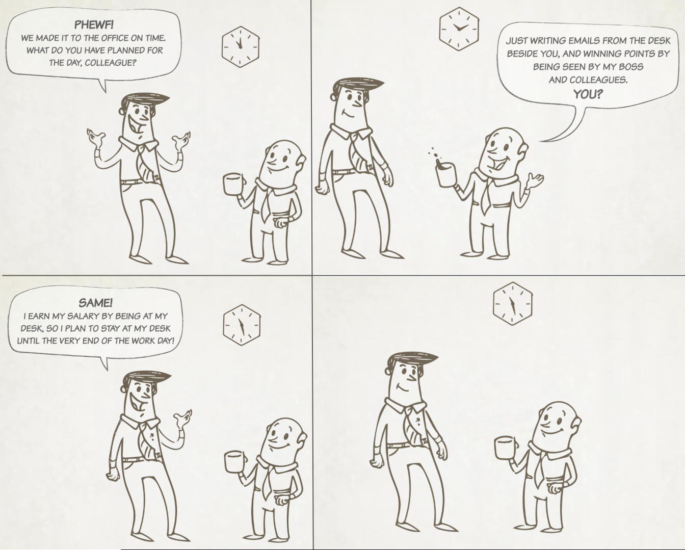
"How to tell if you’re running an old-fashioned workplace" read the headline, and then it got right into it.
One: You're tracking attendance vs results!
Is your team focused on clock-punching instead of goal-crushing?
Do your people think they’ve done their job if they just show up?
Do your employees think that work is just a place?
It’s the first sign you might be running a retro office!
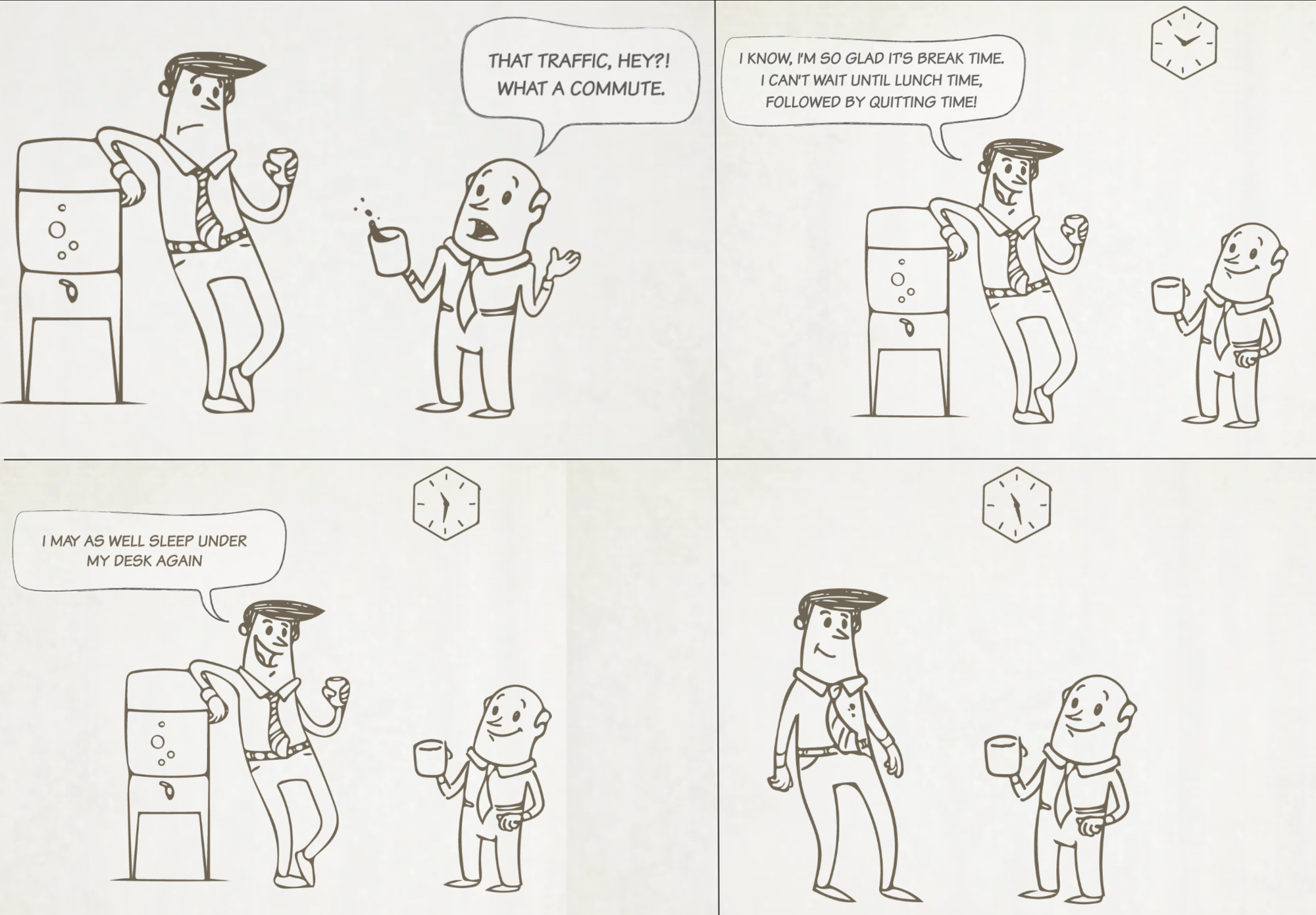
The next headline barrels along into the screen:
Two: Your Team is Overwhelmed by Getting There!
Are your employees exhausted by traffic and working hours?
Does your staff mostly talk about weekends and commutes?
Does it seem your team is not inspired or empowered by their tasks?
That’s sign number two that you might be in a throwback work culture!
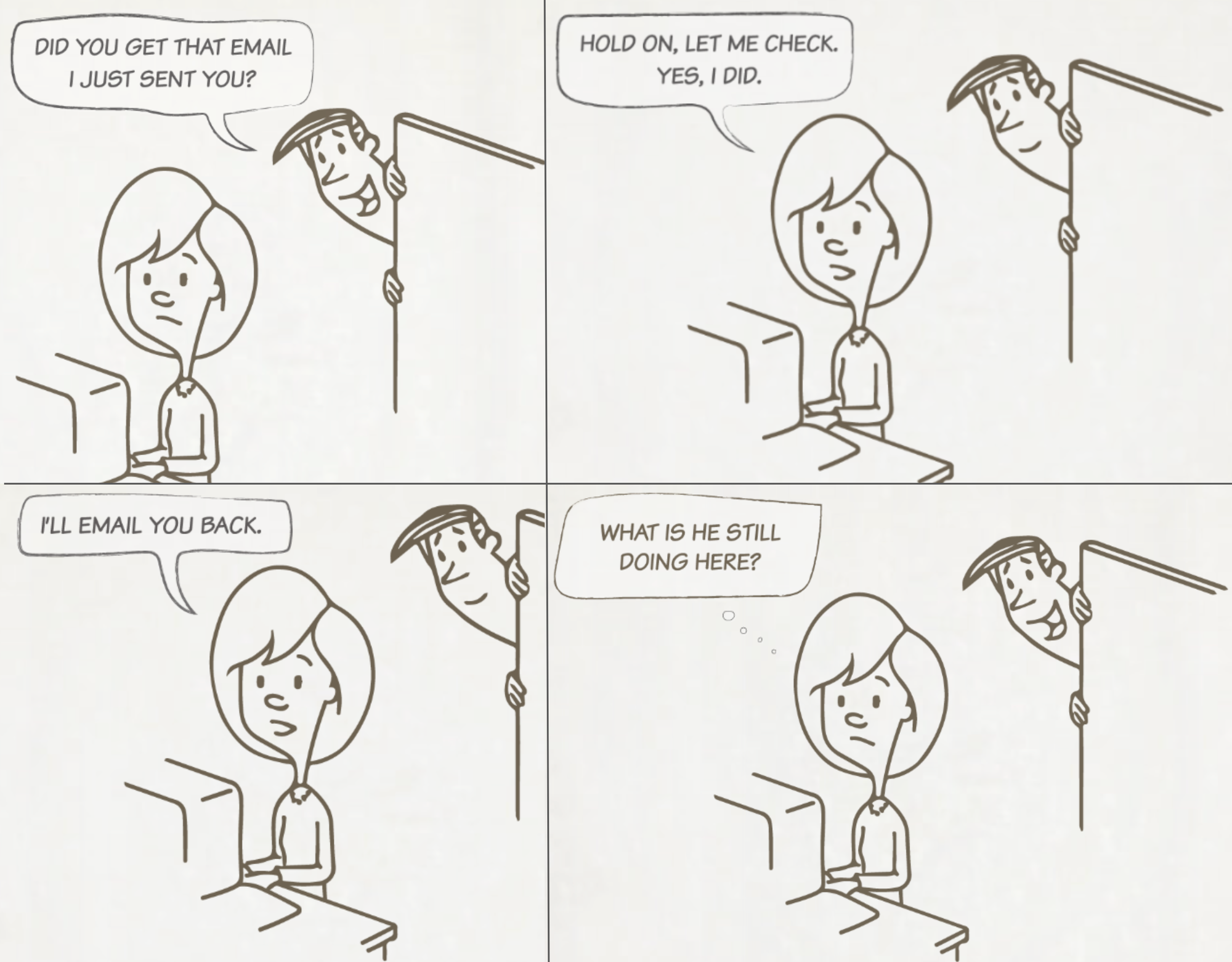
Three: Under-utilized Technology
Does your office email each other... from down the hall?
Do you act like you are spread around the globe, even though you’re on the same floor?
You might be managing a wayback workplace.
Four: Loud and Distracting
Does your team have to come in early to get any actual work done?
Or stay late?
Or wear headphones?
Or work from home?
That might be the final sign that your old-school office isn’t working out the way you thought it would. Work days shouldn’t have to look like this:
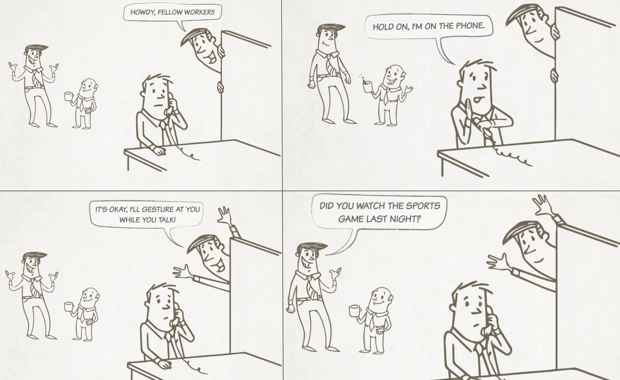
Then the pitch came. The whole site shifts focus into a clean, simple, modern aesthetic and just layouts out the opporunity.
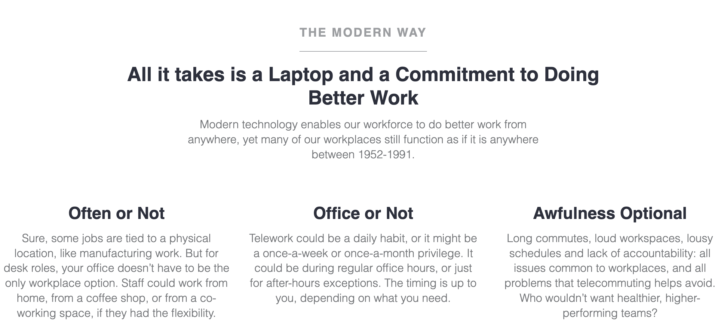
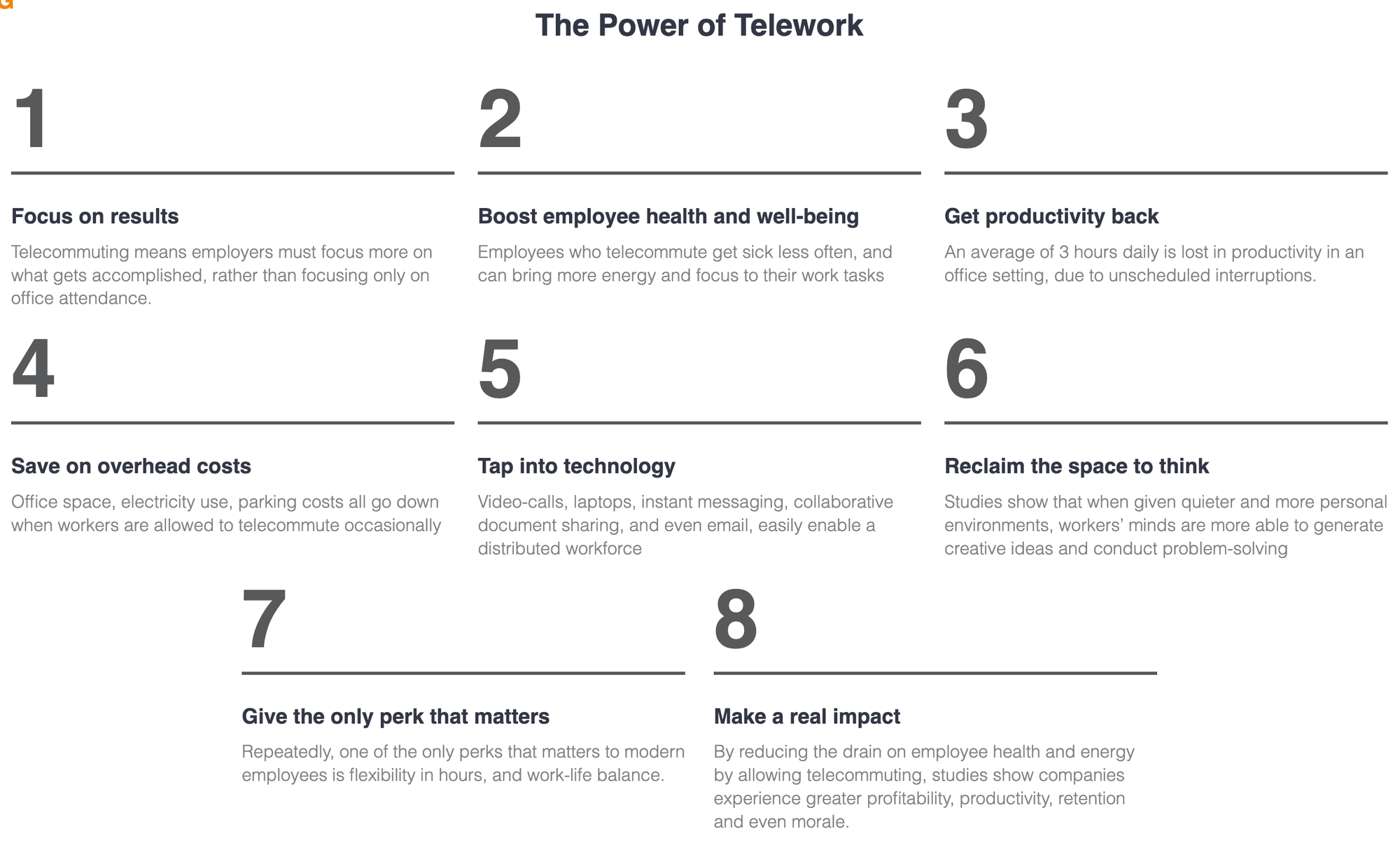
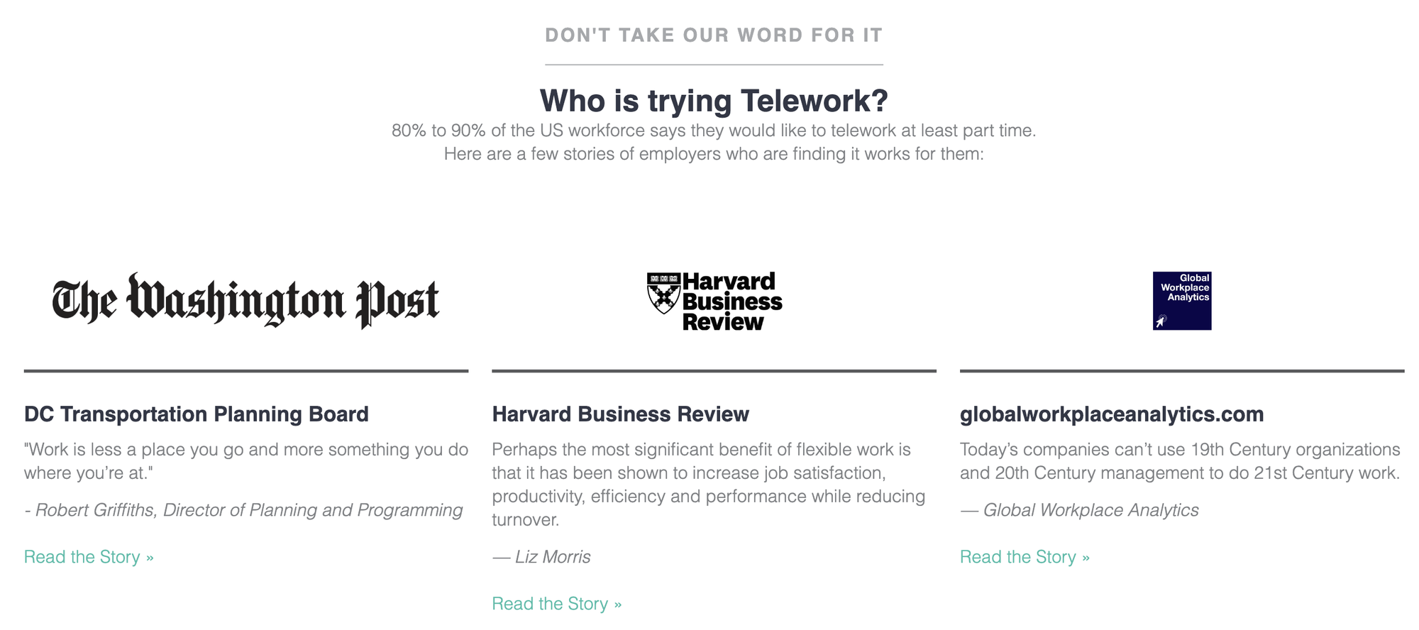
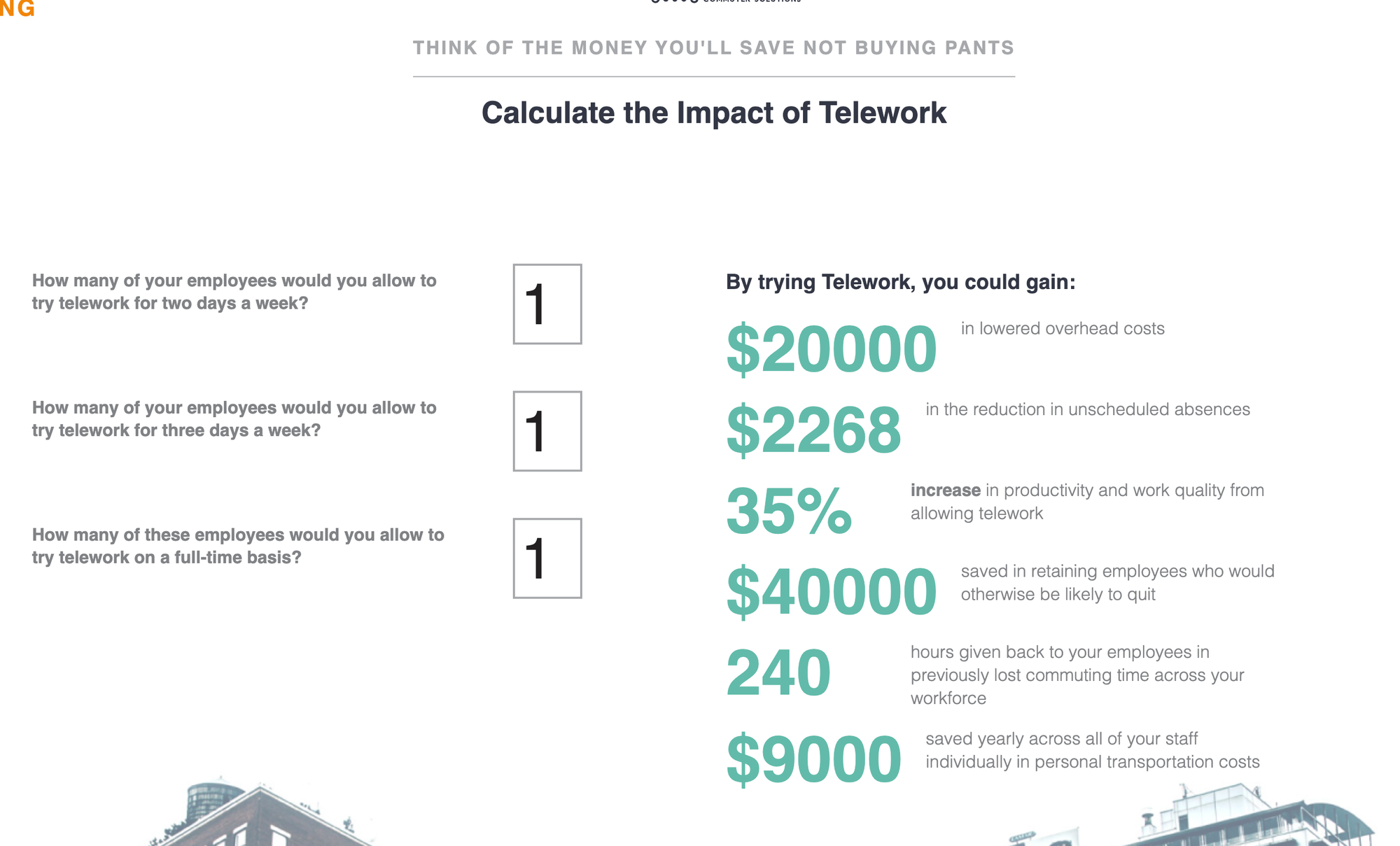
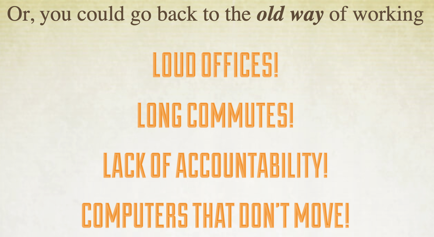
And then, the site glitched back again, warping into flickering project mode:
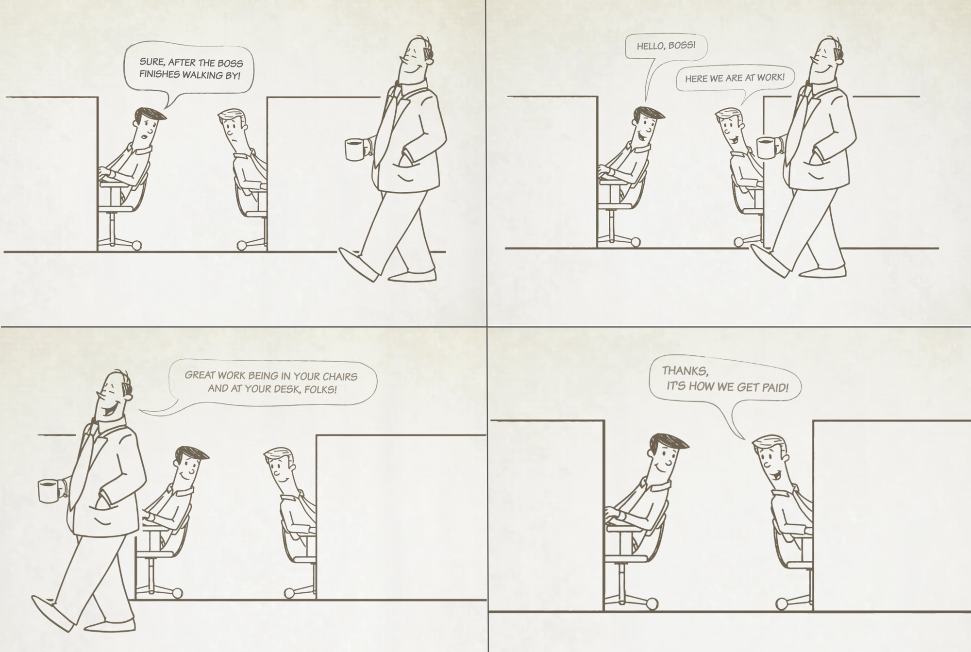
Thankfully, there's another comic to break the tension. The first scene has the employee asking, "Wanna see another cat video?" And then:
The site ends with a gloriously necessary call-to-action for support in transitioning your workforce to a telework model.
Where did this site come from?
It was commissioned by Prince George's County in Maryland, and built by the team at Domain7. Kurt Iverson did the illustrations, and a talented team of devs in-house did the build. I was responsible for the concept, strategy, voice and tone, comic writing, and all copywriting.
You can take a peek at what's left of it over on the Wayback Machine!
