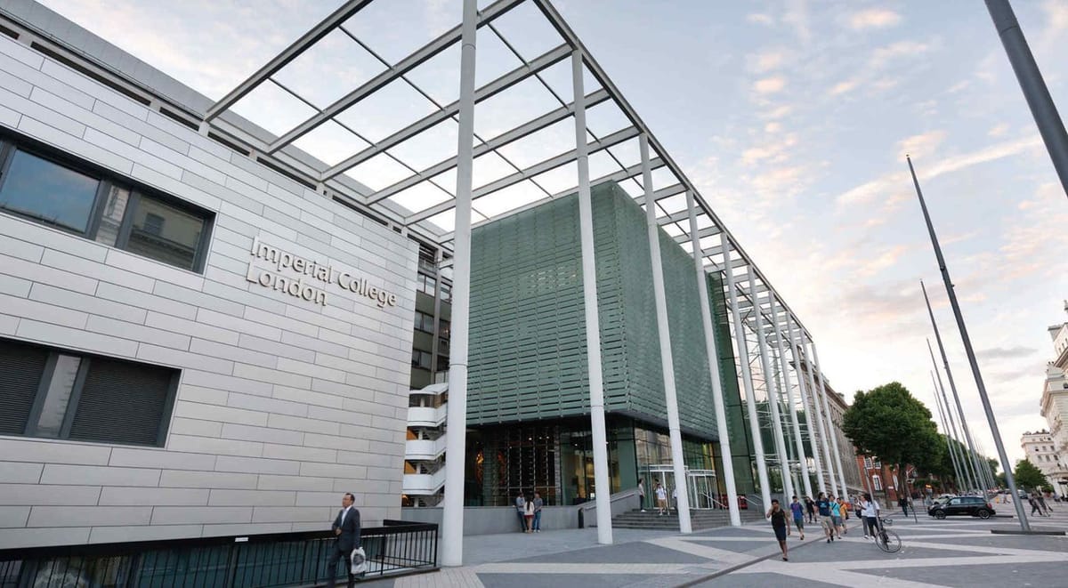
Imperial College London content strategy

A top-to-bottom, content-driven redesign for the world's leading science educator (2013 - 2014)
It was on the grounds of Imperial College London where the industrial revolution was launched, at the Grand Exhibition hosted at Imperial in 1867 – and from there, the world springboarded into a new century of technological growth.
Meanwhile, Imperial never stopped innovating. This quiet juggernaut has been steadily producing talent and breakthroughs for hundreds of years. Emerging from the labs and facilities of Imperial have been: the creation of holograms. The invention of radar. The discovery of penicillin. The prototype of invisibility cloaks, created in 2013. The full list would fill a book.
Imperial’s top competition is Oxford and Cambridge, but then again, it’s sometimes called the MIT of Europe. Year after year, list after list places Imperial in the top 10 of the world’s higher education institutions. Imperial is the place where innovators and tinkerers go to re-create the world. It’s a magnet for geeks of the truest breed, an environment to help genius thrive; it’s a hive of brilliance exploring the fringes of science, technology, engineering, medicine and business.
But the university’s legendary past and bright future were being obstructed by its own web presence:
It was unfocused: Imperial’s brilliant science breakthroughs were being drowned out by routine web content.
It was inflexible: Hundreds of web editors were contributing to unprioritized messaging, and had no flexibility to customize the site to the needs of their own departments and sections.
And it was an obstacle: The content itself wasn’t conducive to viewing on tablets or smartphones, nor was it navigable by screen-readers or via keyboard shortcuts for visually impaired users.
And so naturally, they wanted to work with ME!
chortle chortle
JK. But they did call up the web agency I worked for, Domain7, and invited us to participate in a competitive pitch process, which we eventual won, and an 18-month long redesign process ensured, with the team I worked for taking charge of the strategy, design and front-end development, while integration partners TerminalFour led the CMS build. (Why am I telling you this? Are you asleep yet?)
I was the lead content strategist on the job, and was responsible for:
- Creating a cohesive guiding concept to unify their online storytelling, that came from a content audit, competitive research, and leading the stakeholder engagement and facilitation all across the university. We're talking doctors, students, alumni, faculty, leadership — hundreds and hundreds of folks, multiple campuses...and coming up with a cohesive story to weave it all together.
- Creating voice and tone and editorial guidelines that would guide their 400+ web editors
- Drafting the page tables (indicating content hierarchy for all the key templates)
- Was there more? There had to be. I went to London so many times. My son Ben had just been born, and I got on a plane and flew to the freaking UK! To make it up to my wife, I made this spoof podcast about it for my poor partner Kendra:
I gotta say, I did a pretty stellar Ira Glass impression, yeah?
Okay, where was I? Right. A huge content strategy process for Imperial.
Is it intimidating to do content strategy on a website that receives more than 80 million visitors a year? Where over 100,000 pages dot the archives? Yes, thank you for asking. I nearly croaked. I'm never doing that again.
The site was online for 10 years. It won three HEIST awards and was a Webby Awards honouree.